Concept art in game
Ever wonder what it’s like to design game art? This post is for you. Dive inside the brain of our amazing Art Director, Doug Williams! Using his brain to save — and inspire — yours.
Paragraph holder
The tone for Heartland is different than for the rest of State of Decay 2. How would you describe it?
“The tone is a throwback to the original State of Decay. We played with the colors in that environment a lot more, trying to get a nostalgic Kodachrome look to it. For State of Decay 2 we leaned heavier on more real world tones (maybe a little too hard). Since the original was Crytek, it comes across a little different when in Unreal. The team rebuilt the entire level and tried to get the lighting close to what the first game was, without completely severing it from State of Decay 2.”
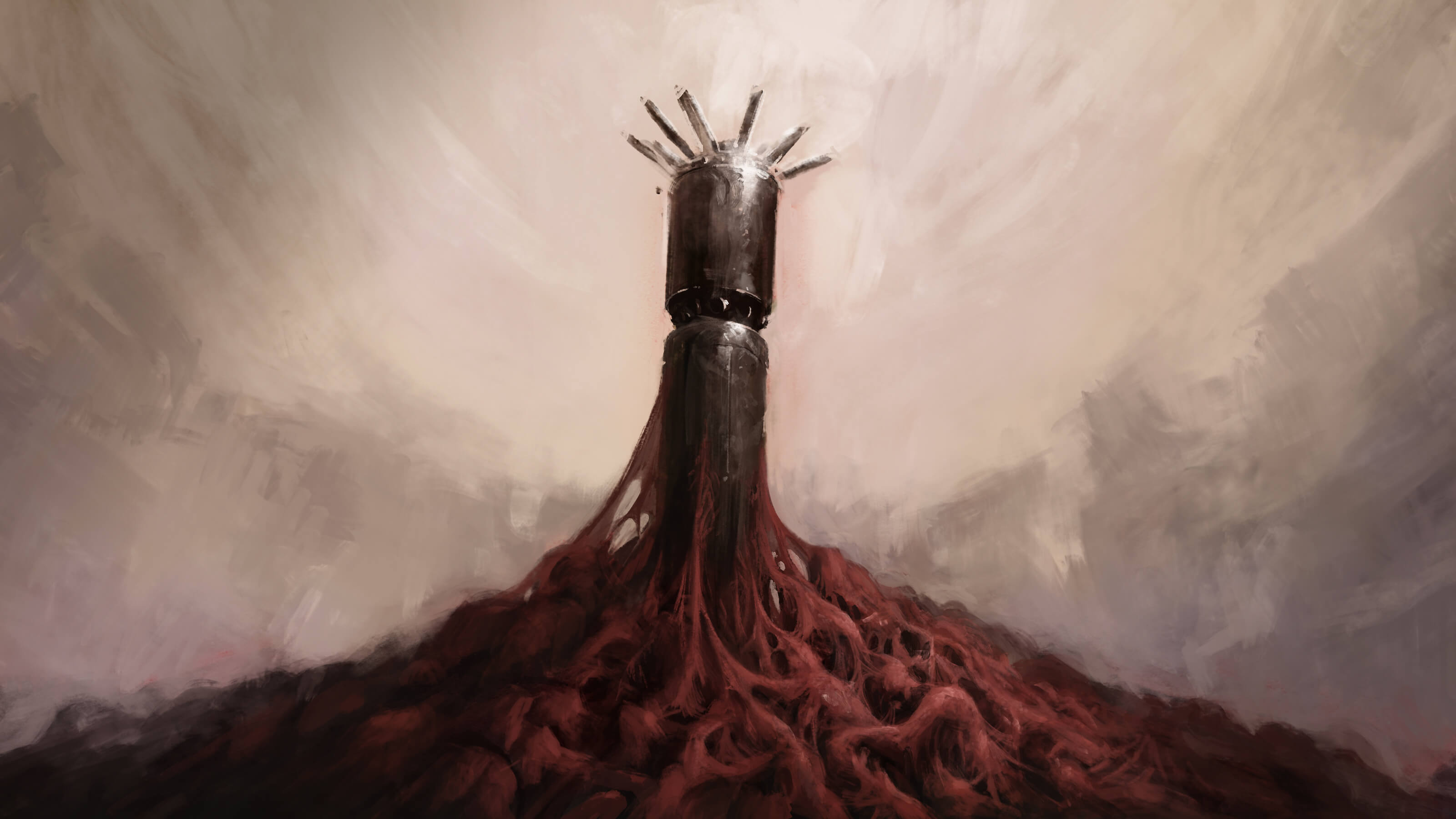
What inspires you when coming up with new ideas?
I think when doing some of the imagery for Heartland I was listening to a lot of Jóhann Jóhannsson’s score to Mandy. It’s heavy, sad and a little nostalgic. Soundtracks help me picture small movies or scenes in my head, and then I pull from those scenes for the concepts.
“I tend to pull from
“Music is probably the main source of inspiration and it’s all sorts; soundtracks, rock, rap, classical…even some country. Of those, soundtracks is probably the main area I pull film and a lot of real world phenomena. Blood Plague is heavily influenced by slime molds, but then pushed into an ‘entertainment’ place with body horror.”
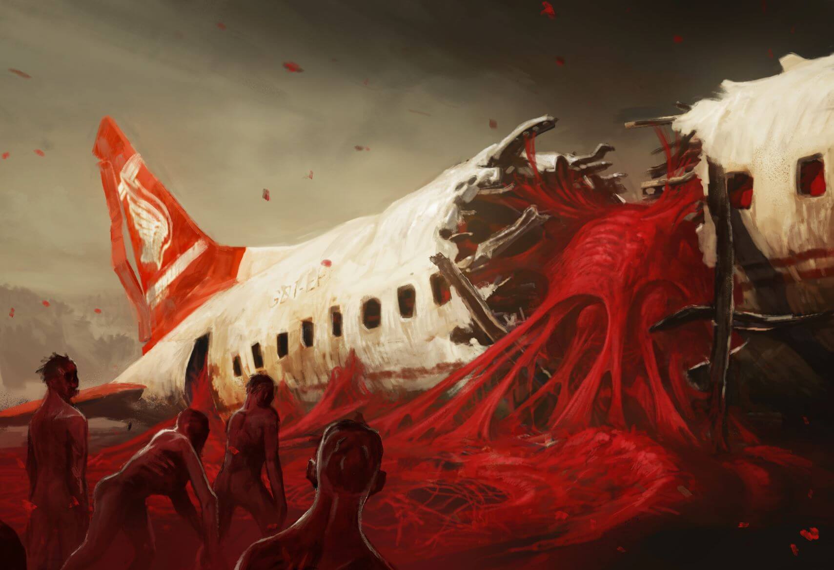
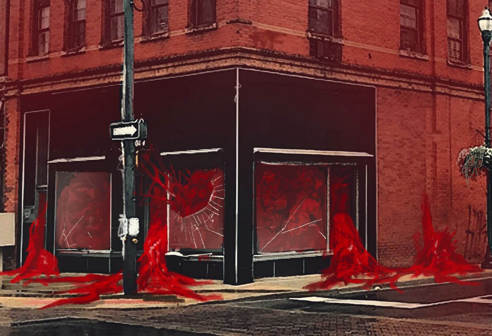
How did you decide which landmarks would be infected?
“Originally I had Jurassic Junction, the downed plane and a shot of Marshall covered in Blood Plague. It was just a few concepts exploring that idea. The design and art teams came up with what to do from there, and how it could be incorporated into game play. Then I did some concepts based on their needs.”
Paragraph holder
What is making concept art like?
“This is a tough one! I love when I’m able to get hyper focused on something, I can sort of block out everything and suddenly I’m realizing how bad I have to go to the bathroom. When you are in that zone ideas can form while working, and you might head down paths you weren’t even thinking of. It can become very fluid.”
Paragraph holder
Paragraph holder
How has the visual style for the State of Decay world evolved?
“Well, the team grew a fair amount from the first game, which allowed us to push more fidelity into certain places. Granted, we’re still a fairly small team (especially when it comes to an open world game) compared to a lot of studios, so we had to find unique ways to get us closer to what a team three or four sizes larger than ours might do. So the style was influenced partially by learning tech that would allow us to try and keep up with larger teams. There’s good an bad aspects to this way of developing, and with Heartland I think we are really blending the feel of the first game with the tech improvements of the second.”
Paragraph holder
What do you want players to feel?
“I want players to feel nostalgia. The first State of Decay was steeped in this heavy sense of an old world gone by that referred to as Faded Americana. It is sort of a imaginary time where wooden console TVs can sit next to an X-Box. I think returning to Trumbull allows us to revisit that sense of nostalgia within our own SoD universe…which is sort of meta. I really hope that old and new players find Heartland to have some new and fresh takes on the genre and that we’re able to continue pushing the State of Decay world into new spaces.”
Paragraph holder
Paragraph holder
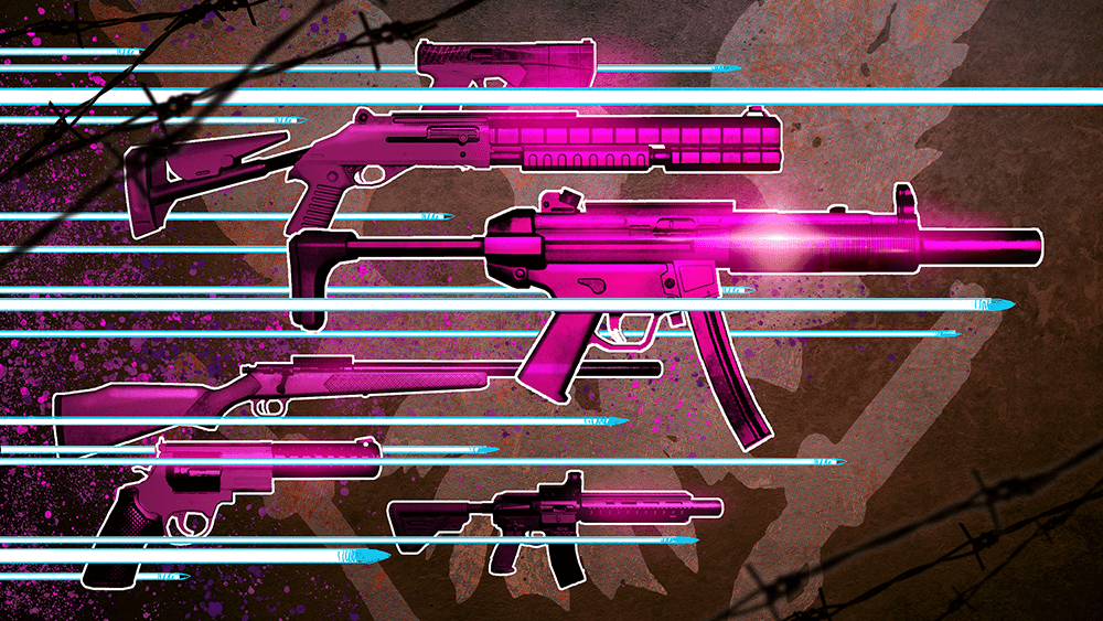
Besides concept art, Doug also designed the achievement artwork for Heartland. Here’s just a peek of some of the gorgeous art trophies that await you. Happy Heartland’ing!
